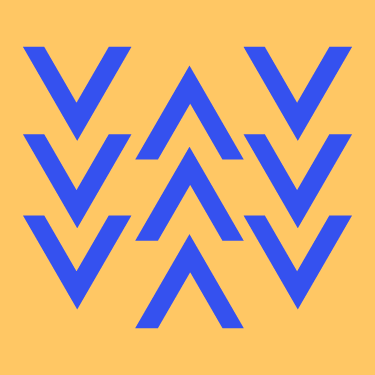
Continuation is observed in the way web design flows. This can be in the form of lines leading you to the next part of the site, or in the way a website animates when you scroll down.
Breaking the flow can allow for emphasis, as it will contrast greatly with everything else on a page, grabbing the attention of the viewer.

Common fate leads the viewer through the side, primarily through scrolling. Common fate can also be observed in drop down menus, as the elements expressed in the menus will be perceived as related due to them flowing in the same direction.
This can be paired very easily with continuation, as they both relate to the way something flows.

Figure/ground is more commonly seen in logo and poster design, as it tricks the eye into seeing two different things in the same picture.
It is similar to closure in the way it is done, but has the added factor of commonly being used to dual-meaning.
The Gestalt principles can greatly improve your understanding of the way people perceive things, allowing you to design with the user in mind. In turn this allows for you to cater the experience of your website though the way it is designed, with people making associations based on the way items are associated with each other.
Chapman, Cameron. “Exploring the Gestalt Principles of Design.” Toptal Design Blog. Toptal, March 27, 2018. https://www.toptal.com/designers/ui/gestalt-principles-of-design.
“The Principles of Gestalt in Web Design.” Pedalo. Pedalo, November 2, 2020. https://www.pedalo.co.uk/the-principles-of-gestalt-within-web-design/.
“What Are Gestalt Principles?” The Interaction Design Foundation. Interaction Design Foundation. Accessed March 17, 2021. https://www.interaction-design.org/literature/topics/gestalt-principles.