By: Jenna DuBois :: 10 hours ago :: 4 min read
When designing something such as a website, going in blindly without putting thought into it can lead to miscommunication regarding the content you want to provide. The gestalt principles stand as a backbone to a design,giving explanation to the way humans perceive information in ways of organization. They take what you see and use it to infer a relationship between elements in a field. This usage allows for the creation of a design that does not need words to translate association.
The term “Gestalt” itself is derived from German, meaning “unified whole”, and was first established in the 1920s by German psychologists.

The principle of closure is simple, and allows for a clear outline of something. Points of interest nestled within something else, giving it dual meaning. Closure can be seen frequently in logo design, with brands such as the World Wildlife Fund and Peacock (NBC).
With closure, the eye is supplied limited information and makes sense of the missing region.

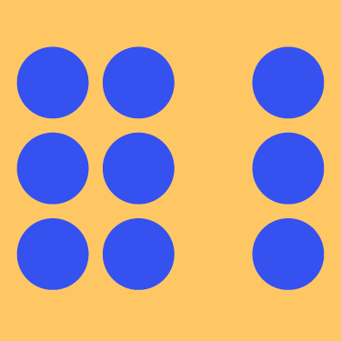
Proximity is one of the most common principles used, and can be observed almost everywhere. Even within the way text is formatted it can be observed, with paragraphs dividing parts of a text to categorize streams of information.
Organizing a design into groups can give way to meaning, and helps the viewer organize what they are seeing.

Similarity is another commonly used principle, as it can be easily created. There are different ways to create similarity, such as color, shape, and size. It can mainly be observed in branding, with companies using a set color palette for their website and products. Similarity can also be applied to the fonts used in text, with headers/titles using a bolder font compared to the body text.
Similarity also allows for anomaly, which is primarily used for emphasis on a specific part, as it stands out from the rest of the design.